

Using infographics in your internal communications is only helpful if they’re straightforward and directly relate to the accompanying verbiage. Otherwise, these just become email attachments that aren’t opened or visual roadblocks standing in the way of an important announcement.
To be most valuable, the infographics you use in internal communications should be:
1. Organized
Make sure the layout of the infographic is clean and doesn’t have too much text on it; otherwise, the key message or takeaway will get lost in the clutter. Format the infographic in a way that flows for the reader. What info is most important to include and what can be left off? Keeping it simple is key. Here are examples of infographics that are way too cluttered at the top of this Piktochart list of helpful tips.
2. Easy-to-read
Infographics that are too colorful or busy will overwhelm the reader upon first glance – the opposite of what you’re hoping to achieve. Using numbered or bulleted text and clean, professional-looking graphics will achieve a harmonious look and will allow the reader to quickly decipher the information. Check out this interactive infographic by The New York Times that shows Facebook friendships by location. The New York Times chose a single pleasing color scheme making the infographic easy to quickly glance at and comprehend.
3. Visually appealing and on-brand
Staying on brand is important. If you manage a construction company, you likely wouldn’t want to use infographics with cartoon images of cats and dogs and frilly, ornate fonts. Ensure that the colors, images, and fonts on your infographics match your existing company’s branding and fit well with your business goals.
 |
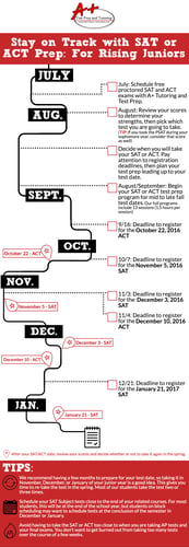 |
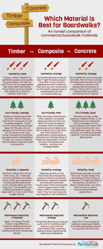
| Product Comparison Infographic | SAT/ACT Prep Timeline Infographic |
In general, infographics, operational process images like flowcharts, and icons (smaller standalone images) should illustrate and mirror the point being made in the communication. For example, if the key takeaway of your internal announcement is to lay out your company’s three main goals for the upcoming quarter, choose graphics that visually represent each goal. This Enplug blog has some additional best practices for internal infographics.
The possibilities are endless for creating infographics! If you don’t have an in-house graphic designer to dream up and assemble infographics, here are a couple tips for creating your own:
- You can find tons of free downloadable templates at your disposal online. Here are some from our friends at Hubspot. Or for inspiration, Hubspot shares some colorful and interesting "Top 10" examples.
- Try using an app like Piktochart to easily customize an infographic with your specific size, color, text, and design specifications.
If you don’t have the time or resources to tinker with the above methods or if you want your own, freshly customized infographics, connect with us! We can help create infographics that work for your business’s communications.